Today we’ll be doing a pretty simple tutorial on how to make a button for your blog.
Blog buttons are all over the sidebars of blogs everywhere. They are especially great because they are free advertising! Check out my last How to Blog without Breaking the Bank post to see the different free photo editing programs there are.
Making a Blog Button with PicMonkey
For this tutorial, we are going to use PicMonkey. Picmonkey offers both a free and paid membership. I pay for the “Royal Membership”, which is pretty cheap. I think it is $5 a month. The only reason I have it is for their extras of more fonts and effects. The free version is also great, so you will still be able to make blog buttons and edit photos if you opt for the free version.
Are you ready to make a blog button? Let’s begin!
Getting Started
You will first need to decide if you want to use a plain background or a photo background. For my Stashbuster Challenge button I used a yarn photo I purchased from Dollar Photo Club. They are now defunct, unfortunately. They were bought by Adobe Stock (which just between you and me, I’m not that crazy about).
When looking for a photo, try to pick one that has some empty space. That is where you’ll put your text. If it is all picture, the text might be a little difficult to read. If you are planning on using a plain background, you are good to go.
Once you have your photo chosen, head over to the PicMonkey site.
Opening PicMonkey
When you first open up PicMonkey you will notice several different options on the main screen. Since I am using a photo for my button I will need to click on the edit button. If you are using a plain background you will choose design.
When you click on the edit button a box will popup for you to choose your photo and upload it to the site. Once your photo is uploaded it will look like this.
On the left sidebar you can see all of the different options you have. Each little picture on the side carries its own set of buttons. Take some time to click on them all to see what each one offers. If the option has a little crown next to it that means it is available to Royal Members only. You won’t be able to use it unless you upgrade to the paid membership.
Sizing Your Button
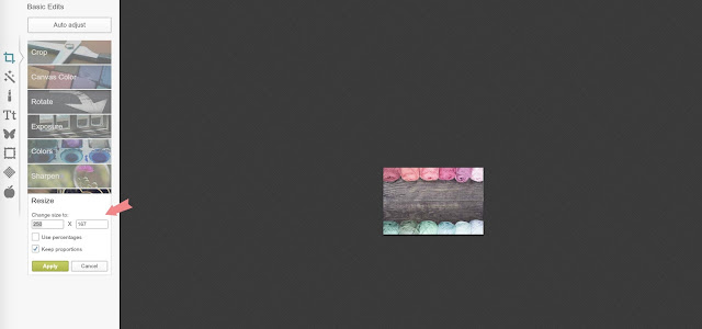
You’ll want to make your button an appropriate size to fit on your sidebar. It really depends on what size sidebar you have. I have read that any button under 200x200px is best. Well, I made mine 250×166, because my sidebar is a bit wider. I’m such a rebel!
Click on the “Resize” button at the bottom of the left sidebar to choose the size of your button.
Adding Text
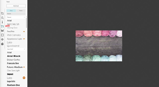
The photo that I chose has a great big empty space, which will be perfect for text! To add some text, click on the Tt icon.
Clicking on the Tt icon opens up the text button. You can see on the left sidebar some of the options for different fonts. There are a lot more available, so be sure to scroll through them all.
Did you notice the little orange crowns? Those fonts are the ones for Royal Members only. Also, see the circle next to the Lato font? It is a little small to read, but it says “New”. PicMonkey adds new fonts and effects from time to time. That is really cool!
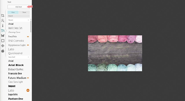
Once you decide on your font, for my button I chose Georgia, click on the name of the font (to select the font) and then on the “Add text” button at the top of the page.
A text box will appear. Click in the box to get a blinking cursor. You can then type your text in the box. You will most likely have to tweak your text a bit.
With my text, I dragged the box to the corners of the photo. To do that, click outside of the text box. A double arrow will appear as you go around the box. Click the arrow on each side and drag the box to the size you want it. You can resize the top and bottom of the box too.
I also centered my text. You can center your text in the pop up text box on the right of the screen. It is highlighted in the above picture.
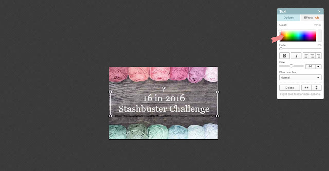
The default text color is black, which definitely isn’t going to work for my dark wood background. To change the color click on the box until the text is highlighted, see above picture. Then pick your color from the color block on the text pop up box. I chose basic white for mine.
Missed any of the series?
How to Blog without Breaking the Bank – Introduction
How to Blog without Breaking the Bank – Part 1: Start a Blog
How to Blog without Breaking the Bank – Part 2: Design a Blog
How to Blog without Breaking the Bank – Part 3: Embellish a Blog
How to Blog without Breaking the Bank – Extra: Make a Blog Button
How to Blog without Breaking the Bank – Part 4: Decorate a Blog with Photos
